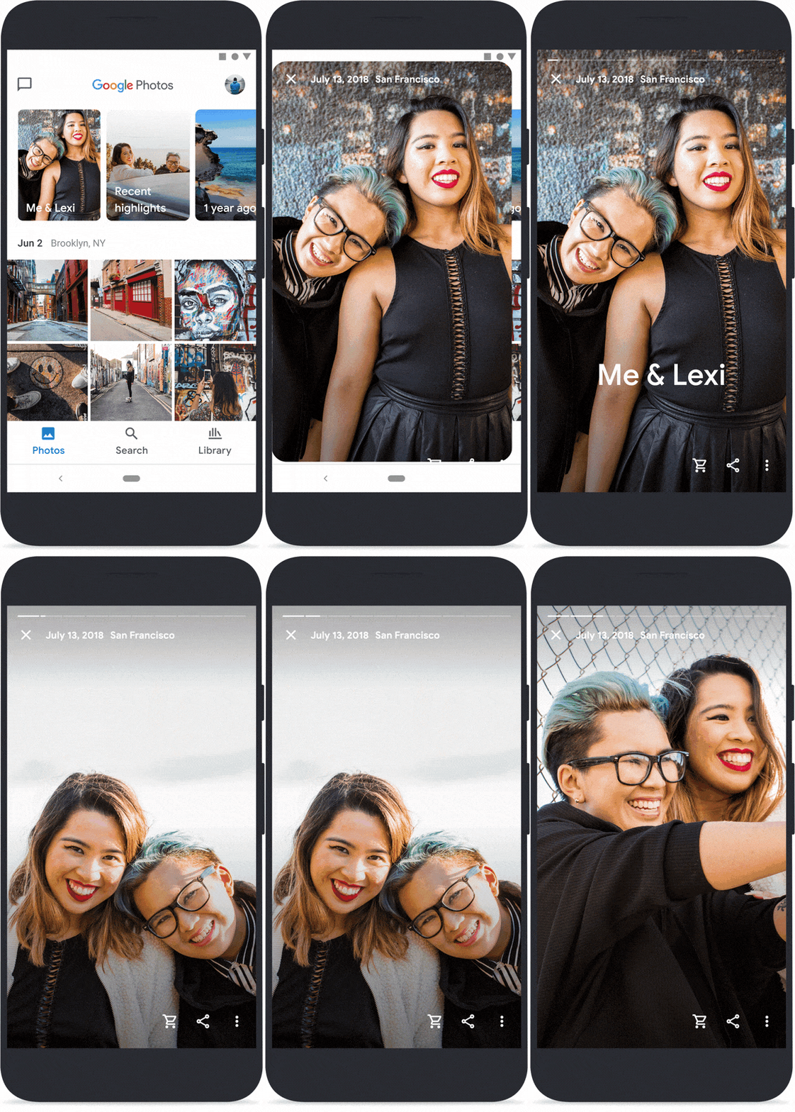
Google presents a redesigned Google Photos app, Photos and videos should be more in the foreground here. It is now divided into three areas: Photos, Search, and Library.


Photos and videos are now presented with larger thumbnails in the Photos tab. Videos play automatically. The white borders between the media content are also narrowed. Memories are now also more prominent: they can be found in the Photos tab above the gallery view. In addition to photos from the previous year, the memory view now also shows special pictures with the partner or friends of the current year as well as highlights from the last week.


Automatic image creations such as films, gifs, or stylized photos can now also be found in the area of memories – the “For Me” tab will, therefore, disappear with the update.
You May Like: The Google Assistant Will Learn A Few New Features in the Coming Months
In order to process traumatic or sad experiences, certain people or periods of time can be hidden in the memories.
With growing photo libraries, the challenges for the search function in Google Photos also increased. The search has its own tab in the redesigned Photos app and highlights people, pets, and places. Here, presumably, one has always relied on machine learning to automatically tag all image content with the appropriate tag.
In the library tab, the organization is now hidden according to albums, favorites, the trash, and the archive. The print service, which is available in Germany for photo products, has also found a new place there.
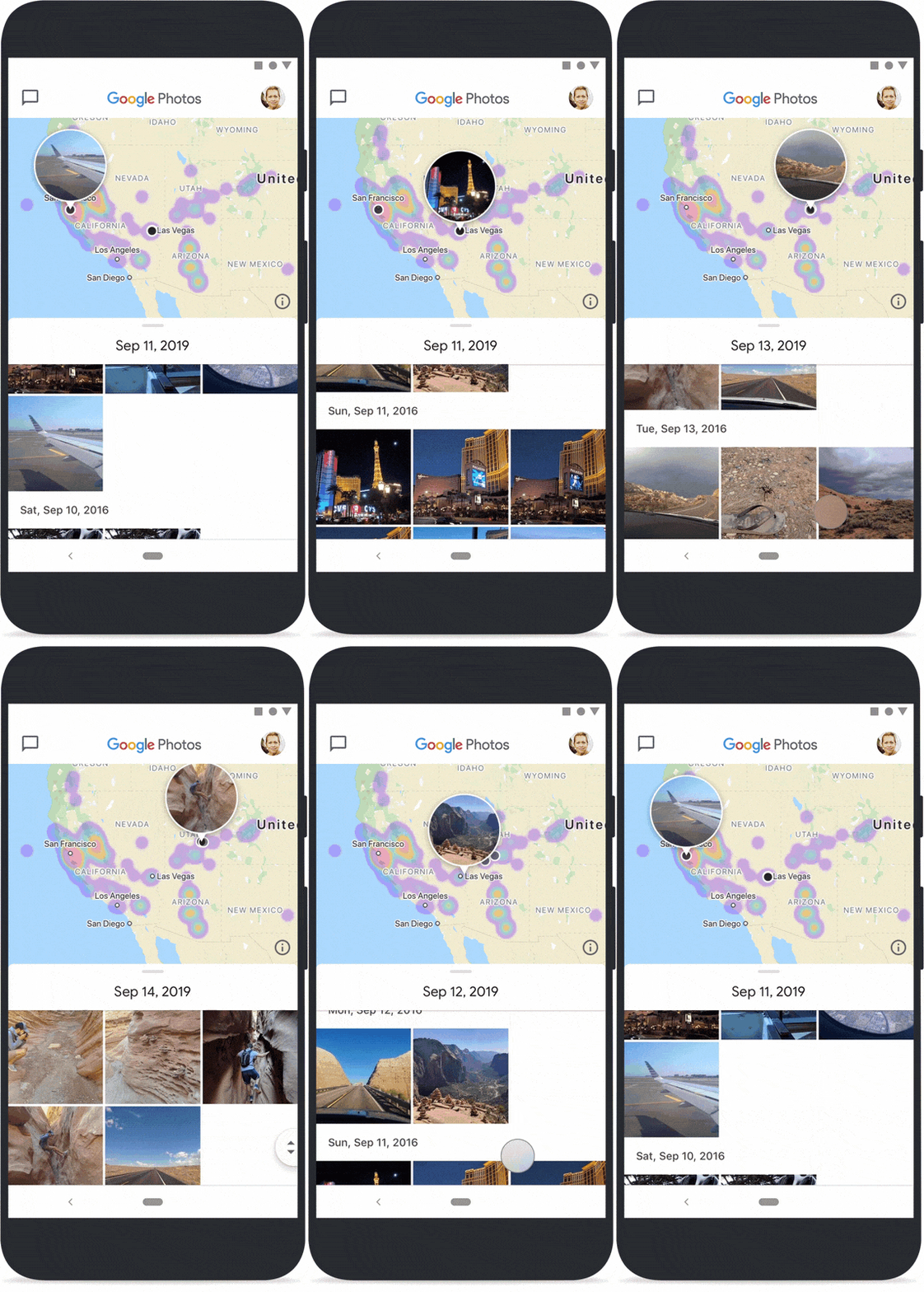
Long desired by Picasa users, now it is here: a map view. This has been integrated into the new search tab. Photos and videos with Geo-Tag are placed on a world map where they were taken. All photos with geo-tag through the camera app, with activated location history or with manually edited location find their place on the map.


With the new update, there is also a change in the app icon – so it is not surprising if it looks different, it should still look quite familiar.


