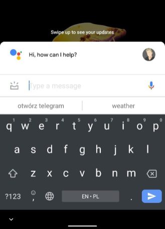
Google is working on a new view for Google Assistant that is now more widely available. There is also a new button that allows you to view previous commands.
[irp posts=”1664″ name=”Google Maps Can Use Live View AR To Calibrate Your Current Location, Orientation”]
Google Assistant appearance
Google comes with an improvement for the display of the Assistant that has been tested since last year. In June, it became known that a larger group of users with a more compact appearance works for the Google Assistant. Now Google has widened its beta testing group again and the company has also further tinkered with the design for the Assistant.
_9To5Google.


The new look of the Google Assistant has been deliberately given a more compact look. You will see this first when you call up the Assistant. We see that the interface takes up less space on your screen and that you also see the profile icon of your Google account. If you tap on it, you will end up in the settings in one go. If you then give a command, the interface again takes up limited space, while Google uses the entire screen every time.
Previous assignments
Furthermore, the buttons for ‘Explore’ and Google Lens at the bottom have not changed, but Google shows some new in the suggestions for commands. There is now a new button with which you can immediately use a previously used command via the history button. You let it scroll through a whole list of all your previous assignments so that you can then select one.
The new-look is again available to a larger group of beta users, although the feature is not yet available to everyone. We didn’t get to see the design on our phones yet.


